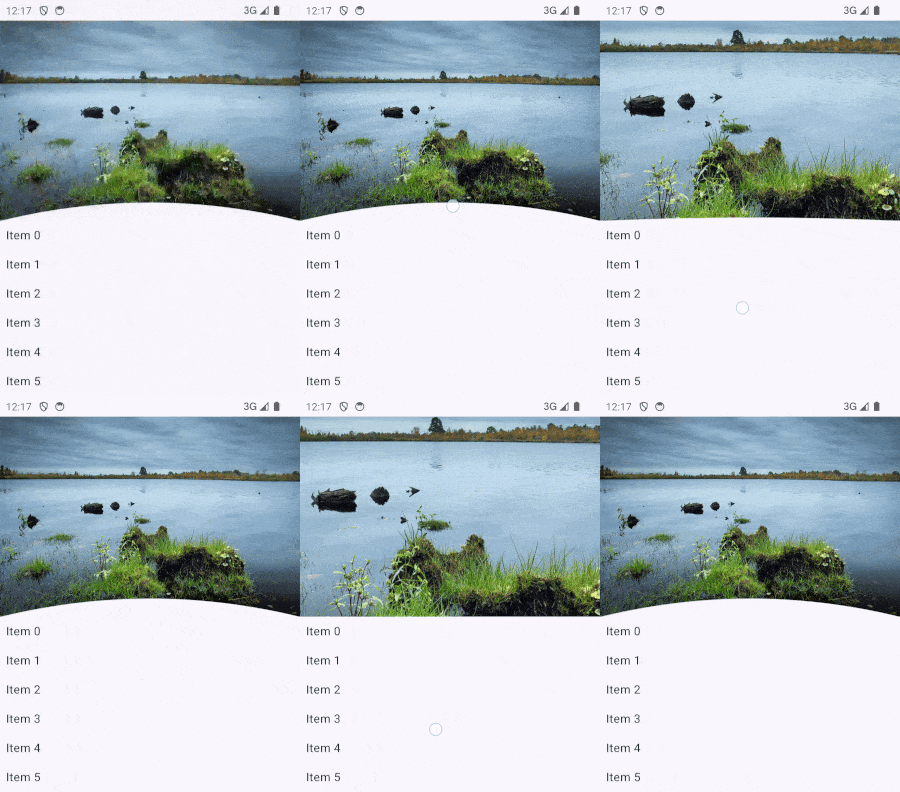
Jetpack Compose provides OverscrollEffect in androidx.compose.foundation to create customizable overscroll effects.
While this works well in many scenarios, integrating it with lazy layout managers like LazyColumn can be less
straightforward. A more robust alternative involves using NestedScrollConnection to create a custom overscroll modifier.
However, this requires overriding methods like onPreScroll, onPostScroll, and onPreFling, which adds complexity.
Interestingly, Modifier.pullRefresh, while designed for pull-to-refresh functionality, bears similarities
with an overscroll modifier, albeit limited to one direction.
In this blog, we’ll creatively repurpose it to build a custom overscroll modifier and
craft an interactive header as shown below:

To start, we’ll design a curved path for the header. The function below defines a quadratic Bezier curve from
the bottom left to the bottom right:
 1
 2
 3
 4
 5
 6
 7
 8
 9
10
11
12
13
14
15
16
17
18
19
20
|
private fun composeCurvedPath(
    width: Float,
    height: Float,
    path: Path,
    curveRatio: Float = 1f,
) {
    path.reset()
    // Move to the bottom left corner
    path.moveTo(0f, height + 1)
    // Define a quadratic bezier curve from bottom left to bottom right
    path.quadraticTo(
        x1 = width / 2, // Control point X
        y1 = (height - height * curveRatio), // Control point Y
        x2 = width + 1, // End point X
        y2 = height + 1, // End point Y
    )
    // Close the path back to the starting point
    path.lineTo(0f, height + 1)
    path.close()
}
|
The curveRatio determines the curve’s shape. A value of 1 creates a full curve, while 0 flattens it into a straight line.
Using this path, we’ll create a composable that draws the path with a solid color:
 1
 2
 3
 4
 5
 6
 7
 8
 9
10
11
12
13
14
15
16
17
18
19
20
21
22
23
24
25
26
27
28
29
30
31
32
33
34
35
36
37
38
39
|
/**
 * This view draws a curved arc
 *
 * @param color: the filled color of the curve
 * @param curveRatio: a ratio of 1 means a complete curve, and a ratio of 0 means a flat line
 */
@Composable
private fun CurvedBackground(
    modifier: Modifier = Modifier,
    color: Color = MaterialTheme.colorScheme.surface,
    curveRatio: Float = 1f,
) {
    Box(
        modifier = modifier.drawWithCache {
            val hasValidCurveParams = size.minDimension > 0f
            if (!hasValidCurveParams) {
                onDrawWithContent {}
            } else {
                val paint = Paint().apply {
                    isAntiAlias = true
                    this.color = color
                    style = PaintingStyle.Fill
                }
                val path = Path()
                composeCurvedPath(
                    width = size.width,
                    height = size.height,
                    path = path,
                    curveRatio = curveRatio,
                )
                onDrawWithContent {
                    drawIntoCanvas { canvas ->
                        canvas.drawPath(path, paint)
                    }
                }
            }
        }
    )
}
|
Here is how it looks using a green background color and a red fill color with a curveRatio of 0 and 1 respectively:

This allows us to create a visually appealing curved header by putting the curve at the bottom of an image:
 1
 2
 3
 4
 5
 6
 7
 8
 9
10
11
12
13
14
15
16
17
18
19
20
21
22
23
24
25
|
@Composable
fun CurvedImage(
    @DrawableRes imageRes: Int,
    modifier: Modifier = Modifier,
) {
    Box(
        modifier = modifier
            .background(MaterialTheme.colorScheme.surface)
            .clipToBounds(),
    ) {
        Image(
            modifier = Modifier.fillMaxWidth(),
            painter = painterResource(imageRes),
            contentDescription = null,
            contentScale = ContentScale.FillWidth,
        )
        CurvedBackground(
            modifier = Modifier
                .align(BottomCenter)
                .fillMaxWidth()
                .height(50.dp),
            curveRatio = 1f,
        )
    }
}
|

Let’s look into Modifier.pullRefresh:
1
2
3
4
|
fun Modifier.pullRefresh(
    state: PullRefreshState,
    enabled: Boolean = true
) = pullRefresh(state::onPull, state::onRelease, enabled)
|
The Modifier.pullRefresh relies on an associated PullRefreshState. Let’s simplify it into an OverscrollState
tailored to our use case:
 1
 2
 3
 4
 5
 6
 7
 8
 9
10
11
12
13
14
15
16
17
18
19
20
21
22
23
24
25
26
27
28
29
30
31
32
33
34
35
36
37
38
39
40
41
42
43
44
45
46
47
48
49
50
51
52
53
54
55
56
57
58
59
60
61
62
63
64
65
66
67
68
69
70
71
|
/**
 * A state object that can be used in conjunction with [overscroll] to add overscroll
 * behaviour to a scrollable component.
 *
 * Provides [progress], a float representing how far the user has over scrolled as a percentage
 * of the [threshold]. Also provides the over scrolled [offset].
 *
 * Should be created using [rememberOverscrollState].
 */
@Stable
class OverscrollState internal constructor(
    private val animationScope: CoroutineScope,
    private val threshold: Float,
) {

    private val offset get() = position
    val progress get() = position / threshold

    private var position by mutableFloatStateOf(0f)
    private var distancePulled by mutableFloatStateOf(0f)

    internal fun onPull(pullDelta: Float): Float {
        val newOffset = (distancePulled + pullDelta).coerceAtLeast(0f)
        val dragConsumed = newOffset - distancePulled
        distancePulled = newOffset
        position = (distancePulled * DRAG_MULTIPLIER).coerceAtMost(threshold)
        return dragConsumed
    }

    internal fun onRelease(velocity: Float): Float {
        animateIndicatorTo(0f)
        val consumed = when {
            // We are flinging without having dragged it down first (for example a fling inside
            // a list) - don't consume
            distancePulled == 0f -> 0f
            // If the velocity is negative, the fling is upwards, and we don't want to prevent the
            // the list from scrolling
            velocity < 0f -> 0f
            // It's already dragged down, and the fling is downwards - consume everything
            else -> velocity
        }
        distancePulled = 0f
        return consumed
    }

    // Make sure to cancel any existing animations when we launch a new one. We use this instead of
    // Animatable as calling snapTo() on every drag delta has a one frame delay, and some extra
    // overhead of running through the animation pipeline instead of directly mutating the state.
    private val mutatorMutex = MutatorMutex()

    private fun animateIndicatorTo(offset: Float) = animationScope.launch {
        mutatorMutex.mutate {
            animate(
                initialValue = position,
                targetValue = offset,
            ) { value, _ ->
                position = value
            }
        }
    }
}

internal object OverscrollStateDefaults {

    /**
     * The distance pulled is multiplied by this value to give us the adjusted distance pulled,
     * which is used in calculating the offset
     */
    const val DRAG_MULTIPLIER = 0.5f

}
|
Since we only need the progress property, all unrelated logic has been removed.
With this simplified state object, we can replicate the behavior of Modifier.pullRefresh
using our custom OverscrollState instance:
1
2
3
4
5
6
7
|
/**
 * Adds overscroll behavior to a scrollable component.
 */
fun Modifier.overscroll(
    state: OverscrollState,
    enabled: Boolean = true,
) = pullRefresh(state::onPull, state::onRelease, enabled)
|
Next, we need to provide a way to create a state object similar to rememberPullRefreshState but way simpler:
 1
 2
 3
 4
 5
 6
 7
 8
 9
10
11
12
13
14
15
16
17
18
19
20
21
22
23
24
|
/**
 * Creates an OverscrollState that is remembered across compositions.
 */
@Composable
fun rememberOverscrollState(): OverscrollState {
    val scope = rememberCoroutineScope()
    val thresholdPx = with(LocalDensity.current) { OverscrollStateDefaults.THRESHOLD.toPx() }

    val state = remember(scope) {
        OverscrollState(
            animationScope = scope,
            threshold = thresholdPx,
        )
    }

    return state
}
internal object OverscrollStateDefaults {
    /**
     * The maximum allowed over scroll distance
     */
    val THRESHOLD = 80.dp

}
|
The OverscrollState can be easily passed into CurvedImage as shown below:
 1
 2
 3
 4
 5
 6
 7
 8
 9
10
11
12
13
14
15
16
17
18
19
20
21
22
23
24
25
26
27
28
29
30
31
|
@Composable
fun CurvedImage(
    @DrawableRes imageRes: Int,
    overscrollState: OverscrollState = rememberOverscrollState(),
    modifier: Modifier = Modifier,
) {
    Box(
        modifier = modifier
            .background(MaterialTheme.colorScheme.surface)
            .clipToBounds(),
    ) {
        Image(
            modifier = Modifier
                .fillMaxWidth()
                .graphicsLayer {
                    scaleX = 1 + overscrollState.progress
                    scaleY = 1 + overscrollState.progress
                },
            painter = painterResource(imageRes),
            contentDescription = null,
            contentScale = ContentScale.FillWidth,
        )
        CurvedBackground(
            modifier = Modifier
                .align(BottomCenter)
                .fillMaxWidth()
                .height(50.dp),
            curveRatio = 1 - overscrollState.progress,
        )
    }
}
|
The overscrollState.progress dynamically scales up the header image during over-scrolling
while flattening the curve proportionally.
With everything in place, we can now apply the custom modifier to a scrollable screen:
 1
 2
 3
 4
 5
 6
 7
 8
 9
10
11
12
13
14
15
16
17
18
19
20
21
22
23
24
25
26
27
28
29
|
@Composable
fun ScrollableScreen(
    modifier: Modifier = Modifier,
) {
    val overscrollState = rememberOverscrollState()
    Scaffold(
        modifier = Modifier
            .overscroll(overscrollState)
            .fillMaxSize()
    ) { innerPadding ->
        LazyColumn(Modifier.padding(innerPadding)) {
            item {
                CurvedImage(
                    modifier = modifier.fillMaxWidth(),
                    overscrollState = overscrollState,
                    imageRes = R.drawable.img1,
                )
            }
            repeat(20) {
                item {
                    Text(
                        modifier = Modifier.padding(8.dp),
                        text = "Item $it",
                    )
                }
            }
        }
    }
}
|
With just a few lines of code, we’ve successfully integrated a custom overscroll effect and
a visually appealing curved header into our app.


